Blazemane wrote:I figure in a Gallery post, you can make your art appear as big as you want it to--you're showcasing your work; may as well showcase it the way you want to.
True, but I worry about such things like that since.. I use a gigantic monitor as my main monitor on my desktop. I imagine it effects viewing for others on this site, like Starshadow or Nighthunter who access the forums from their cellphones.I've tried using internet off my PSP in the past and even viewing BWI for the heck of it, and.. frankly it was awful.
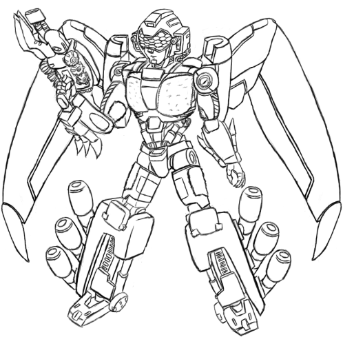
Blazemane wrote:Aerostriker's got incredible detailing! He seems like he could belong in the movie universe, only without being visually confusing the way that a lot of the movie models are (the way are to me, at least). And for some reason, I really like the swift talons hanging off of his back.
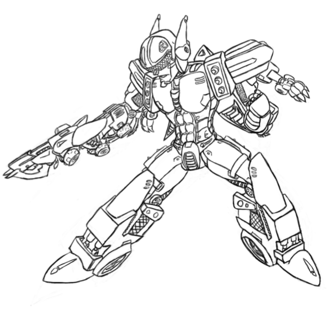
Yeah, never been fond of the movie universe, mostly since they don't have a consistent style between things and have them as kinda bug looking.. though I don't mind Transformer Prime's style as much since it's more.. toned down and from a video standpoint the scenes are better done as it seemed almost like between explosions, Michael Bay was trying to hide the imperfections of the transformers by having extreme closeups whenever possible and reduce CG work for the rest of the scene. Or maybe that's just my animation nerd senses.. For a bonus. Originally Aerostriker was going to look like this and be bigger, but I didn't like how it turned out.

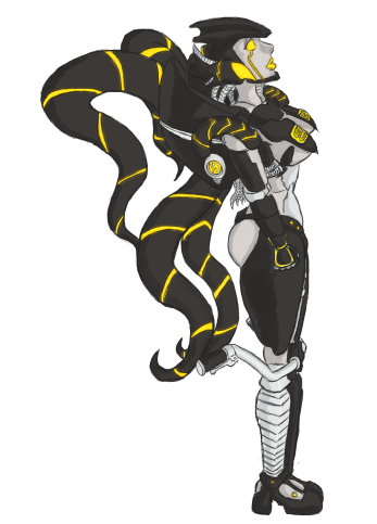
Blazemane wrote:Cecaelia's color scheme really works for me, too; I really don't know the first thing about doing visual art, so this is going to sound incredibly basic, but... I like how the different shades and then the hazes around the yellows make her look like she's glowing.
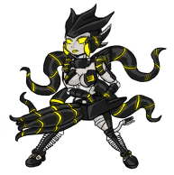
Cece's color scheme and design is based off art Starshadow originally did for the character. At one point, she mentioned there was no way to make Cece look cute to me. I took that up as a challenge and drew this

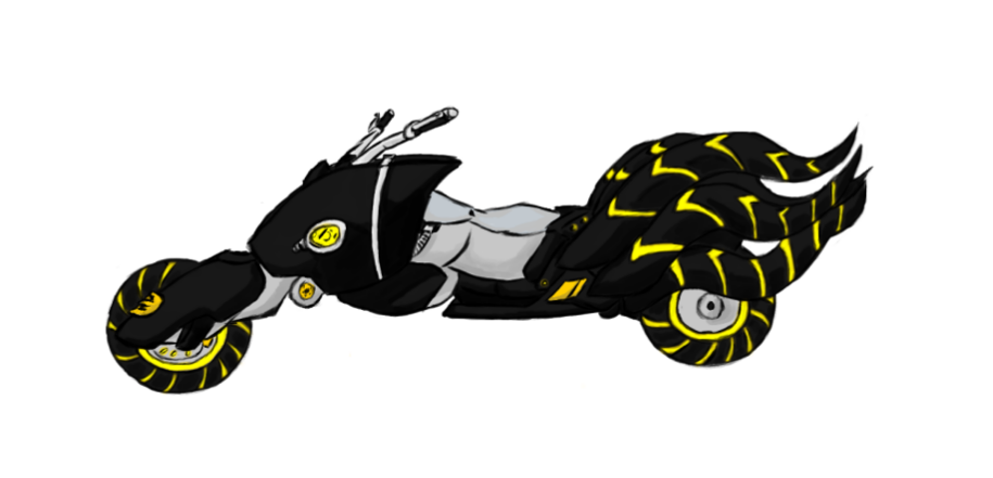
And then later, while learning new software, did up the bike mode.

There's some inconsistency here and there.. but they do look neat for the most part.
