Page 1 of 1
Battlemap Set 2
Posted: Sat Mar 10, 2012 1:25 am
by NaitoKage
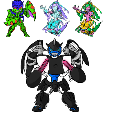
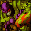
Alrighty. From the left, we have Manterror, based off the toy rather then the comic art since.. I really don't like what IDW did with Manterror at all.
Then is two colors at Aphrodite. The blue version (which will be the canon color scheme) was done by Cubic, as she seemed to want a other type of seahorse colorscheme instead of a leafy sea dragon color scheme.
Then at the bottom, is S1 Orcariner.
Need to do up more predacons.. and maybe some item images like Rattrap's bombs, Stasis pods, Jamming towers, and other things.
Re: Battlemap Set 2
Posted: Tue Mar 13, 2012 11:12 pm
by WorpeX
AWESOME! Love Manterror, definitely preserved his character well! Although hes blue instead of purple. haha. I'm curious though, what is it about the IDW art that you don't like? I really don't see a difference between the toy and the art... the only thing that's changed is the face which is green around the eyes instead of purple but thats super minor imo.
Re: Battlemap Set 2
Posted: Wed Mar 14, 2012 6:16 am
by NaitoKage
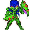
This better?
As for the IDW version, the details are changed alot, he wouldn't have teeth like he currently does and some minor details in the face, arms, knees and so on.
Edit: Huh.. posting it on Photobucket makes it more purple.. but on my photo program it's blue. That's.. weird. 0_o
Trying again..
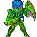
Seems too washed out and pastel.. >.>
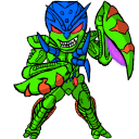
Edit: Orcariner Blue now.
Re: Battlemap Set 2
Posted: Wed Mar 14, 2012 7:50 am
by WorpeX
no no, i meant the other way around, hes supposed to be purple, not blue. >.<
I see what you mean about the teeth. They're like human teeth in the toy, but in the comics its pretty much his entire mouth. Never noticed that before!
Re: Battlemap Set 2
Posted: Wed Mar 14, 2012 7:55 am
by NaitoKage
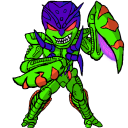
Better?
Re: Battlemap Set 2
Posted: Wed Mar 14, 2012 8:54 am
by WorpeX


 Better?